Designing for real community impact
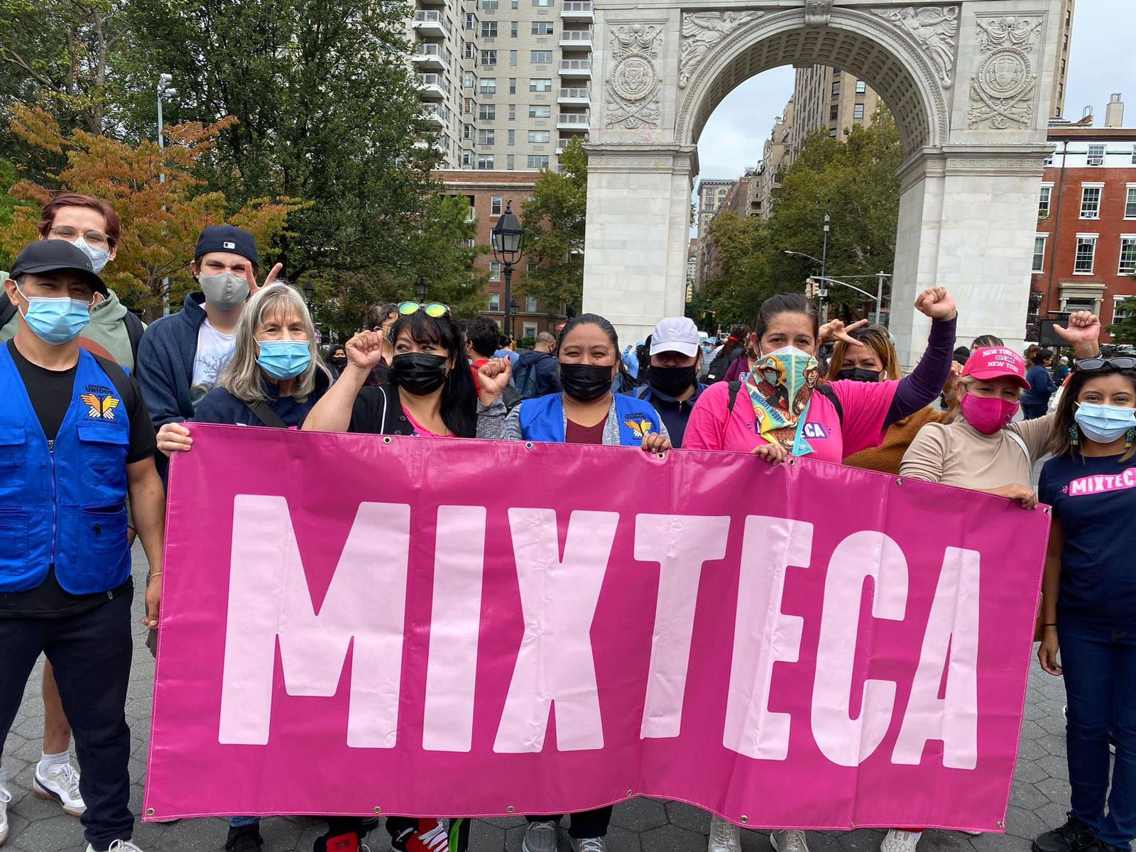
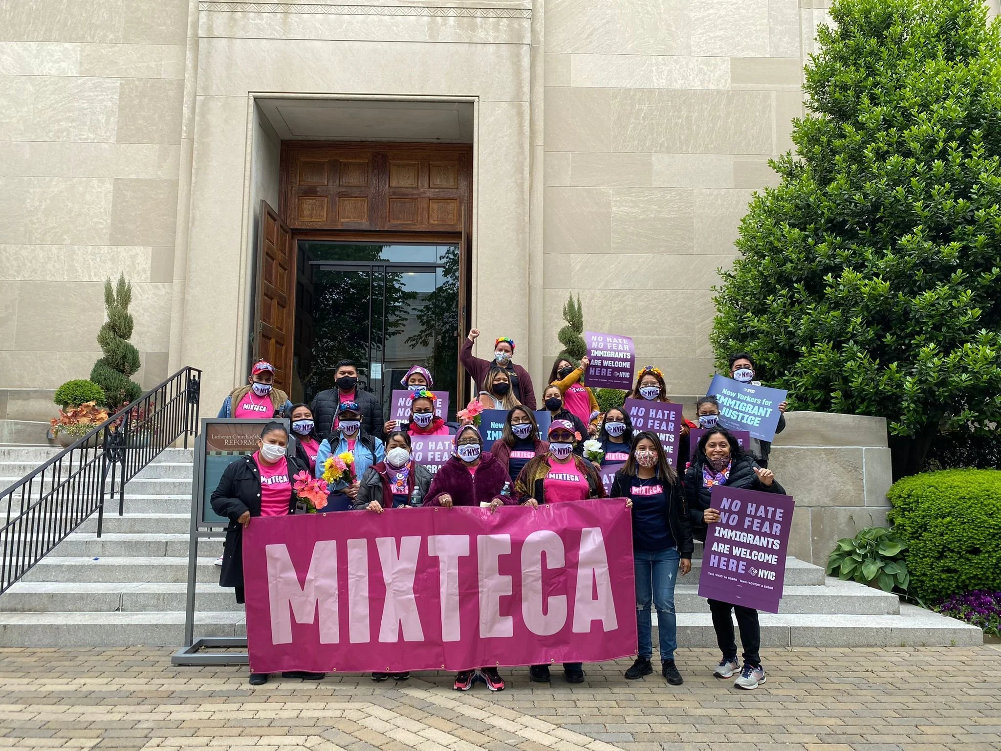
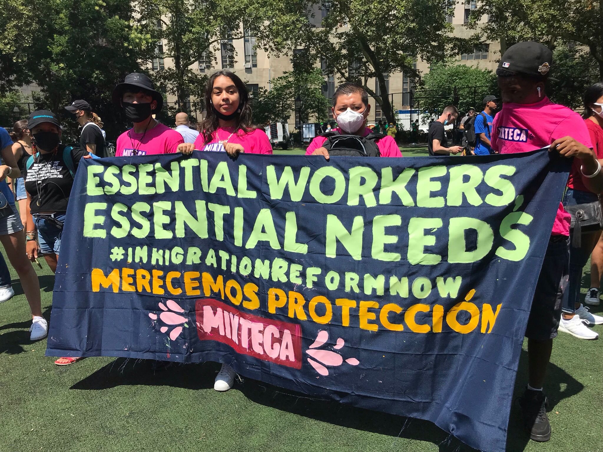
Mixteca is a nonprofit providing culturally-informed services, skill-building, and immigrant advocacy to spanish-speaking immigrant communities around New York. They came to us needing a new, scalable brand identity that could empower and articulate the organizations mission for years to come, while welcoming and inspiring immigrants to break down barriers and seek out support.
We wanted to deliver an identity as beautiful as that mission.
We needed a visual hook
The legacy identity was collegiate and un-emotional. It was “pillar of the community,” but it ended there. But Mixteca the organization is also bright and vital. We had to capture that spirit and connect with Latin American cultural heritage in an authentic, original way.
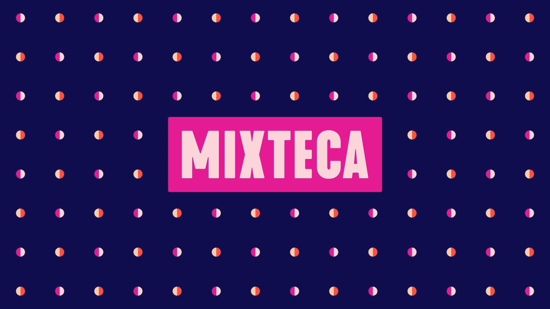
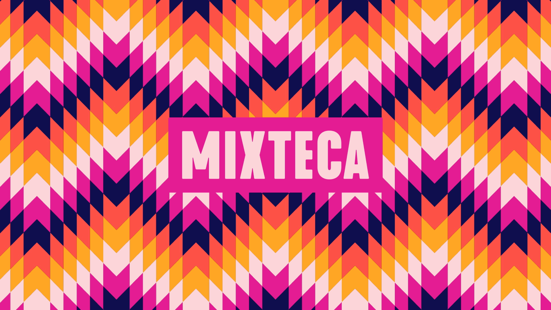
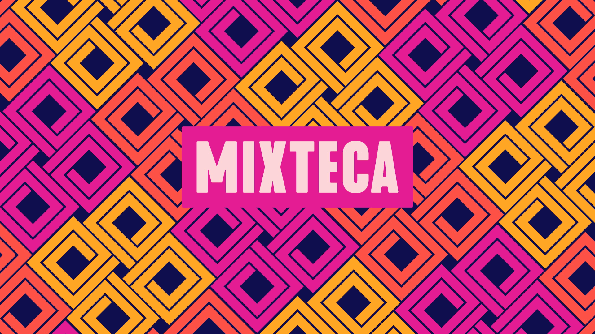
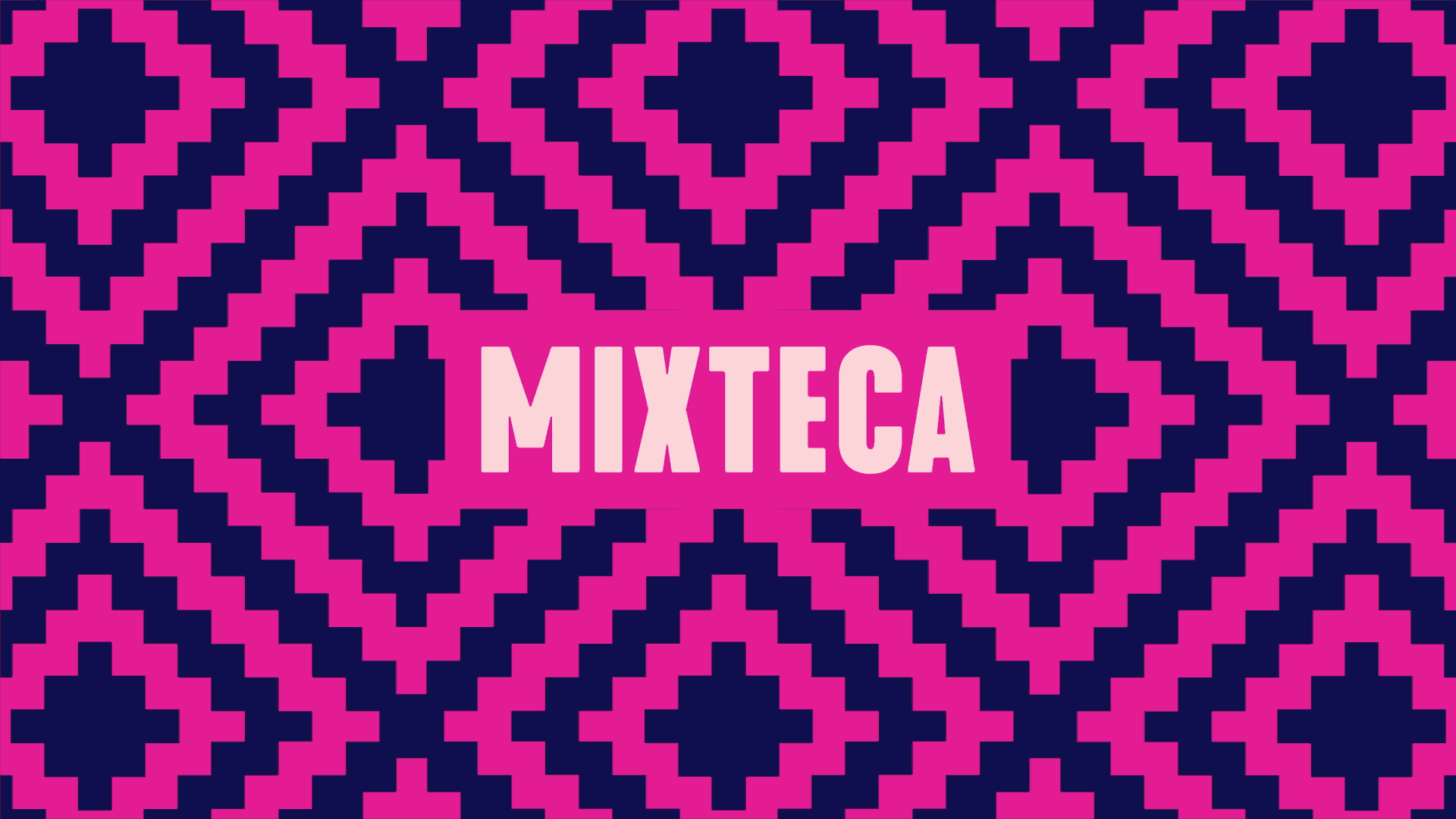
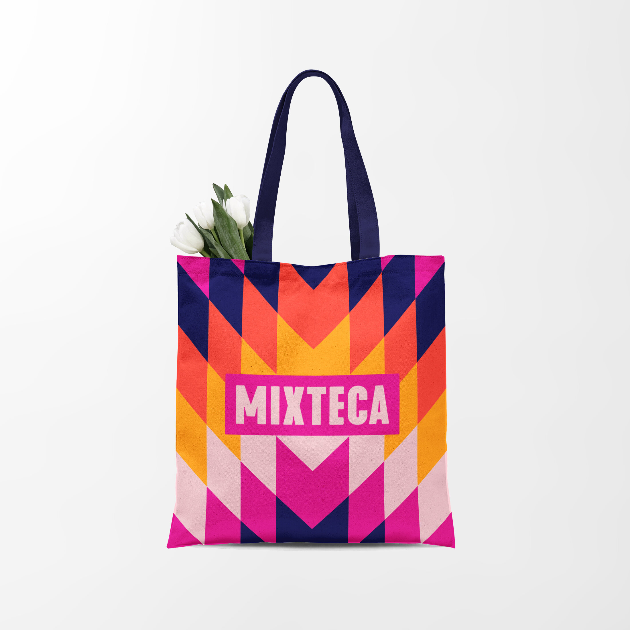
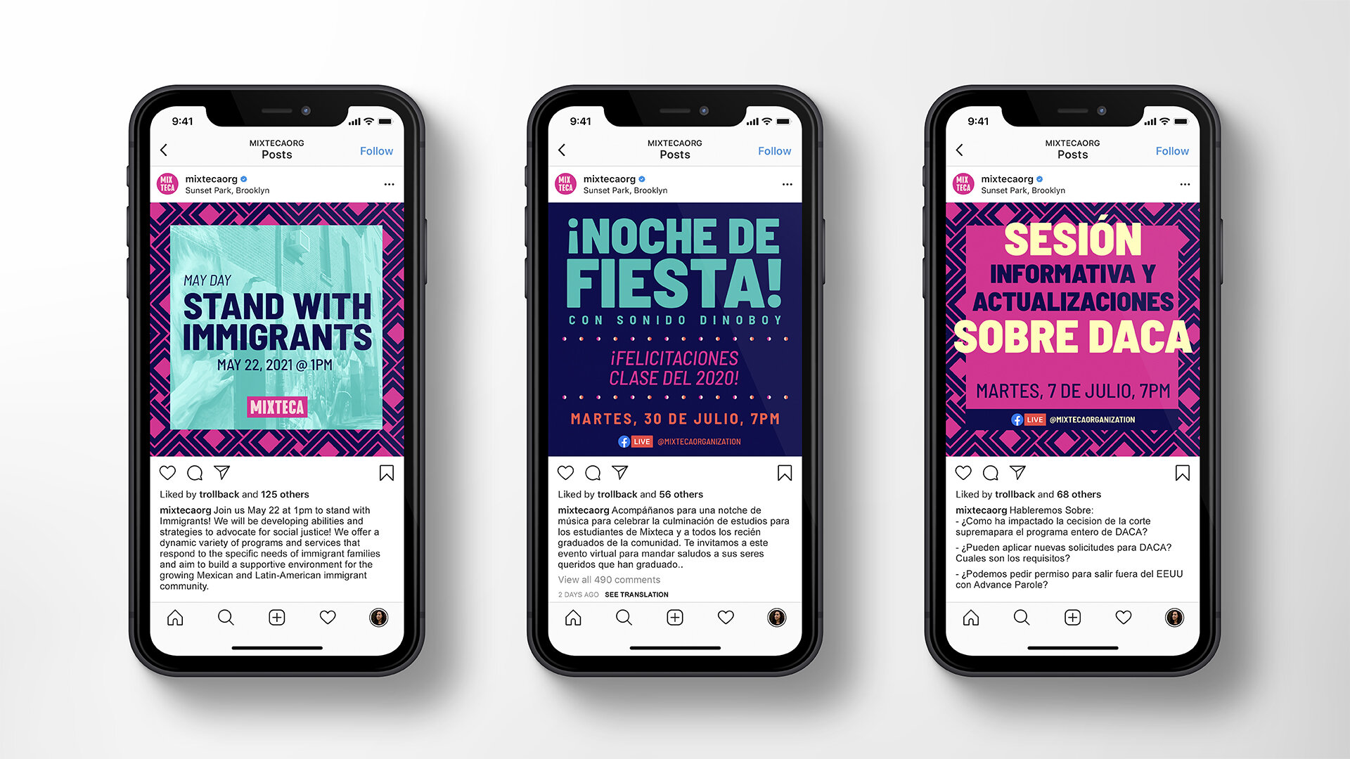
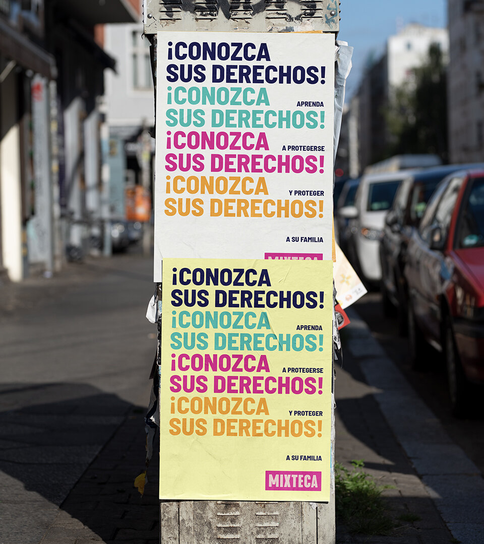
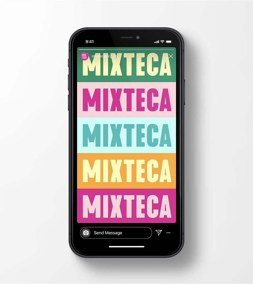
The wordmark and logo we created is bold and strong and bright and fun. It flexes across print and digital activations—signifying strength and warmth in every application, from a banner at a rally to an app icon.
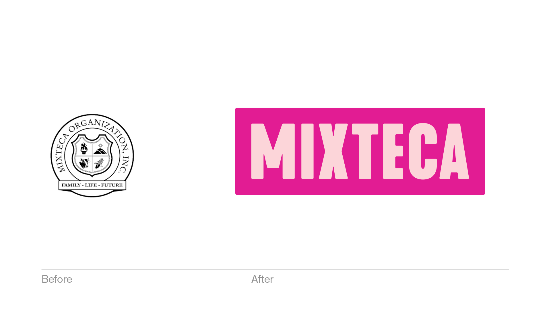
A confident and dynamic word mark, designed to stand out in print, digital and social. Custom, active patterns. A warm, energetic color palette. A free Google font combined with a clever logo activation system allows Mixteca to balance practicality and creativity across all brand messaging.
We set out to build a modern, empowering, intuitive system that helps Mixteca’s impact reverberate across its website, social channels, activism, and beyond.
Creative directing this project was a joy. The Mixteca teams is passionate and inspiring, and the only creative constraint was that the new brand be as vibrant and essential as the organization and its work.