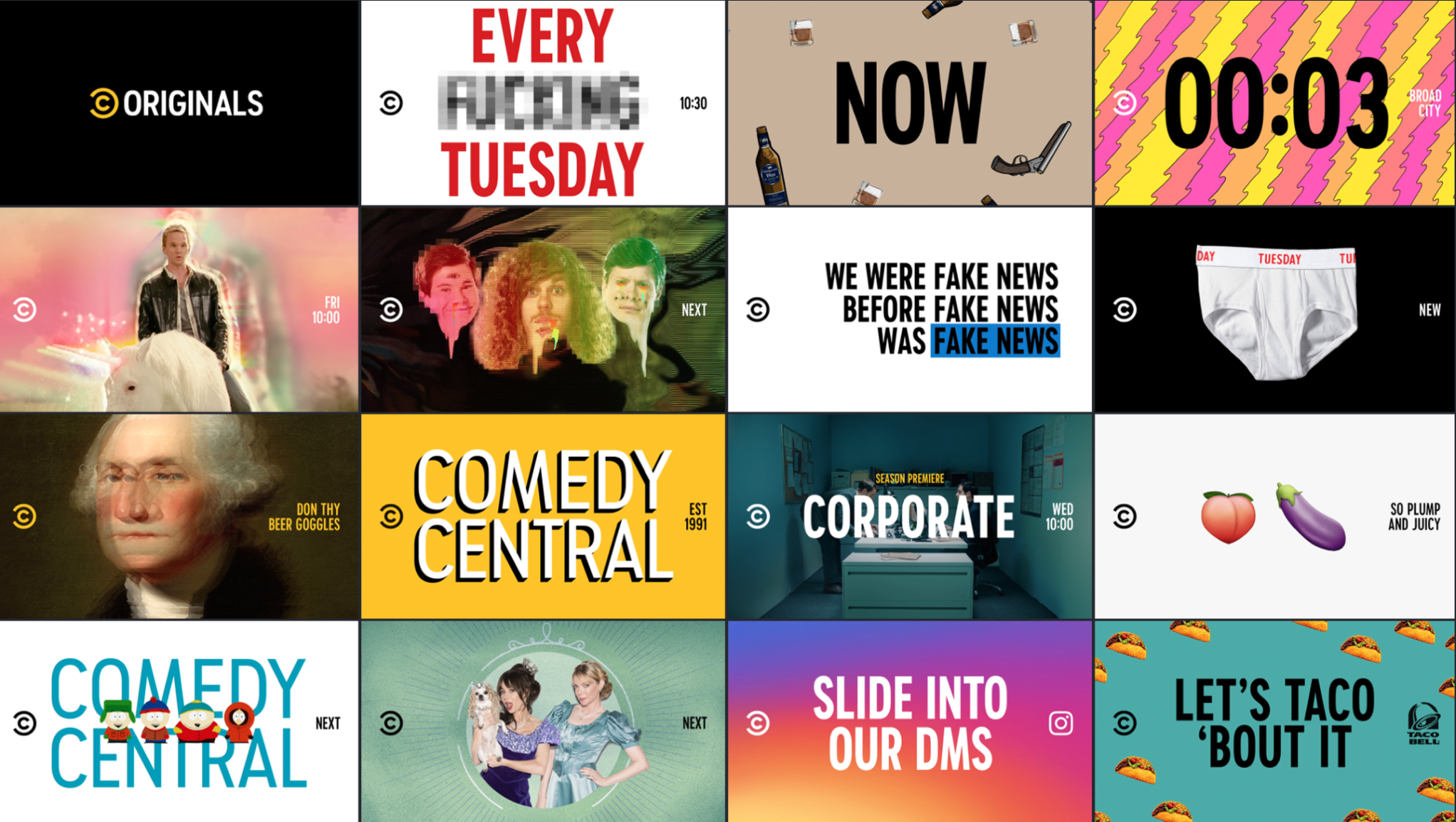
Rethinking, not reskinning
We started from the concept that Comedy Central is more than just a TV network — it's an entertainment brand that lives on multiple platforms. It wasn't about reskinning, it was re-thinking the way the brand is experienced. We explored solutions for on-air, digital, social, out of home, and created guidelines for all platforms. Most importantly: the content is the star.
A New Toolbox
Our toolbox included a refined logo, custom typeface, signature brand color, and design systems across all platforms.
Comedy Central needed a typeface that would be ownable on all platforms. It needed to be clean, bold, and 'supportive funny'. It's inspired by the "C" in the logo, and condensed to fit in tight places for maximum impact.
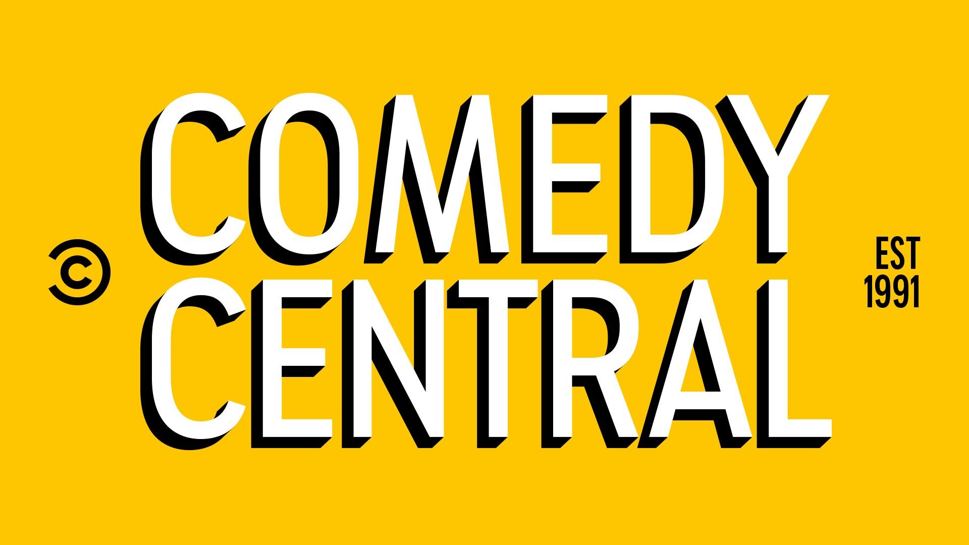
Signature Color
Moving away from a multi-colored palette was key to ensuring cross-platform attribution. Our new signature color helps anchor the brand and the new navigation system. The signature color, Summer Ale, is bright, welcoming and ownable.


On Air Package
Our goal was to find a way to communicate information to the viewer in a way that would maximize the time spent on punchlines rather than elaborate endcards. Ultimately, our end goal was to NOT make promos. We set out to redefine a promo as FUNNY CONTENT in and of itself.