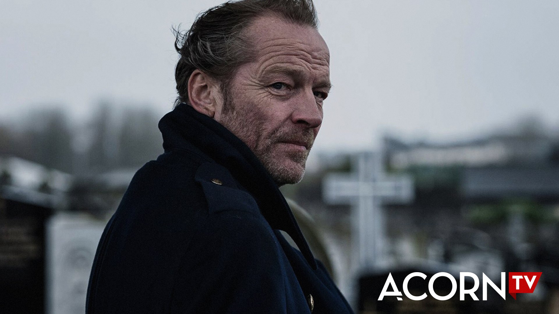
Updating a beloved brand to take over the world of streaming
AcornTV came to us to refresh the brand in preparation for a major international expansion. As creative director, I wanted to craft an updated identity that would evolve the brand beyond a static logo into a dynamic attribution system, while appealing to the quirky, sophisticated fandom of their of fiercely devoted audience
Evolving into an icon
We evolved the previously nondescript “TV” holding shape into a flag, because to its audience AcornTV is a beacon—a place audiences know they can aways find compelling content, a place that feels like an adventure whenever they dive in.
Inspired by the channel’s British mystery roots, we reimagined AcornTV’s relationship with its audience of ‘Inquisitive Adventurers’ everywhere. An updated logo and art deco-inspired typeface retain Acorn TV’s quirky, classic brand character while modernizing the identity to stand out on streaming platforms.
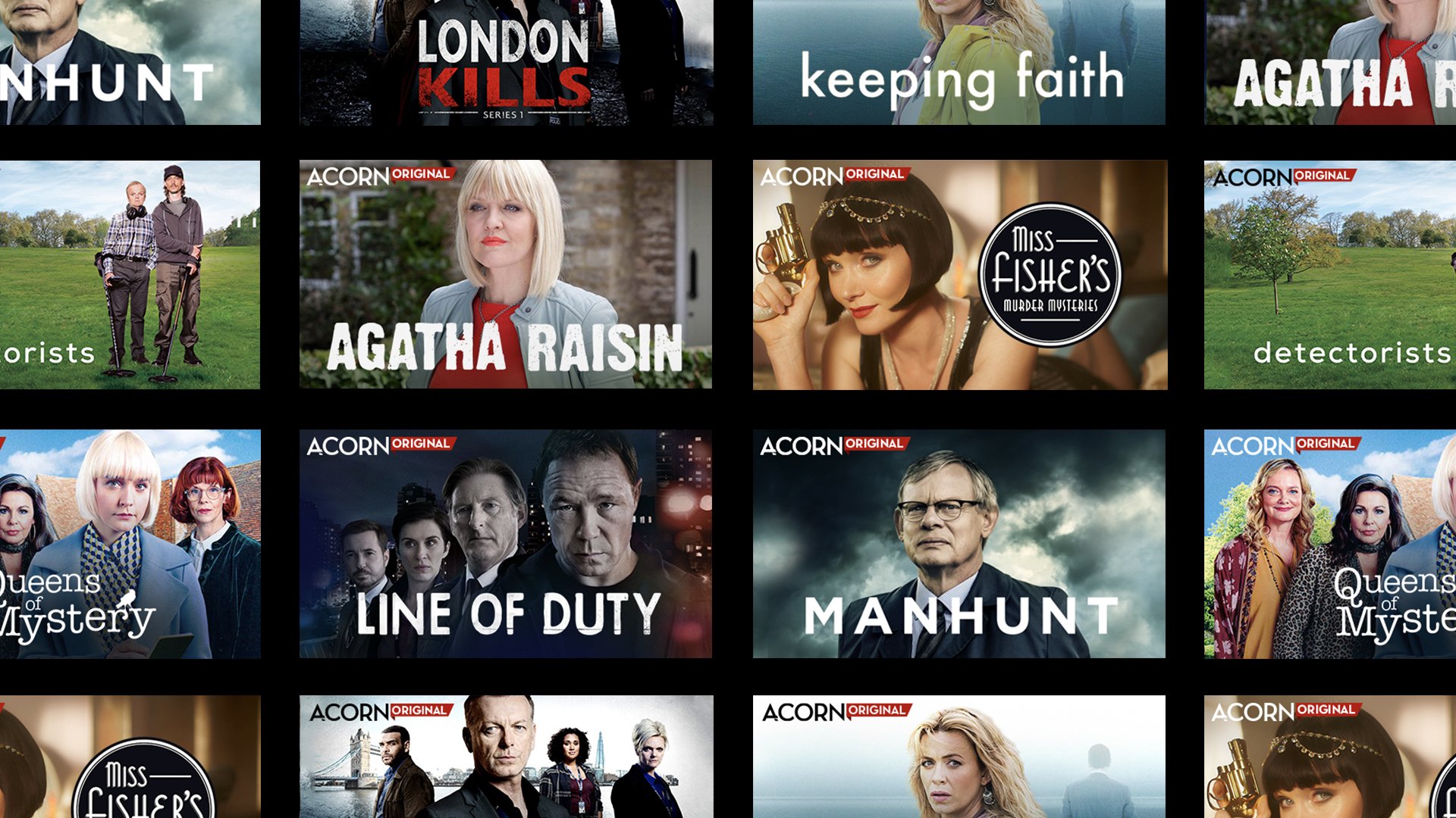
A dynamic attribution device
Beyond a static logo, we turned the flag into an adaptive attribution device, acting as a dynamic showcase for Acorn TV originals, genres, marathons and collections.

Cross platform recognition
A core challenge for modern brands is maintaining attribution not just in marketing, but also across platforms and even as an app. For Acorn, we created a custom ‘A’ monogram that is both eye catching and intuitively connected to the logo.
The A button adapts the logo into an app icon, and can also carry the brand as a social avatar, ensuring consistent attribution wherever AcornTV is delivering or discussing its content.