Iconic legacy reimagined
When it was first introduced in 1962, Paul Rand’s ABC logo mark was iconic. Simple, flat, clean, scalable. But in the decades since, that legendary visual identity was updated, and updated, and updated again… to re-align it with every taste and trend imaginable. By 2020, the iconic design legacy was all-but unrecognizable.
But a strong legacy always presents design opportunities. When ABC came to us for a rebrand—to simplify and streamline their identity for a multi-platform, digital-first era—we could look to the past for inspiration.
As design director, I set out to explore the concept of reconnecting with the brand’s visual roots.
Bringing the Rand back into the brand
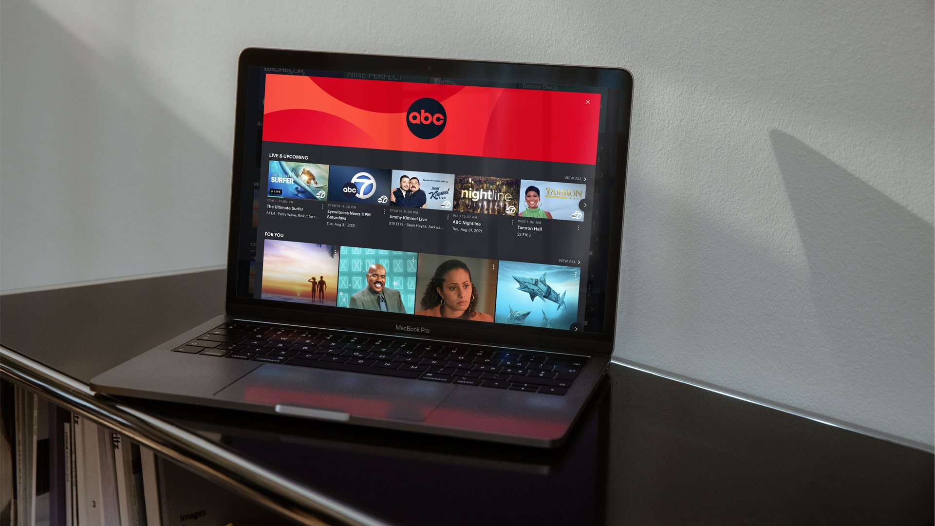
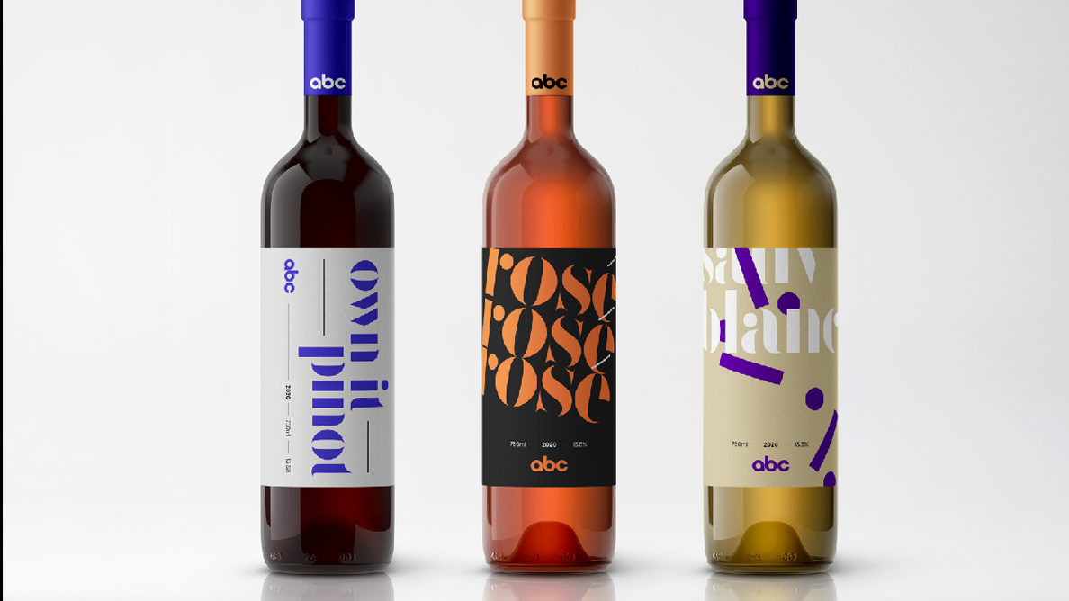
With a project this scale, we know that our final visual identity is going to have to flex, as a system, across all the applications and touchpoints that modern entertainment brands need to flex.
But we start the creative process without those limits. Imagining what if every individual element could stand alone and on its own be active and free.
Inspiration:

Exploration:
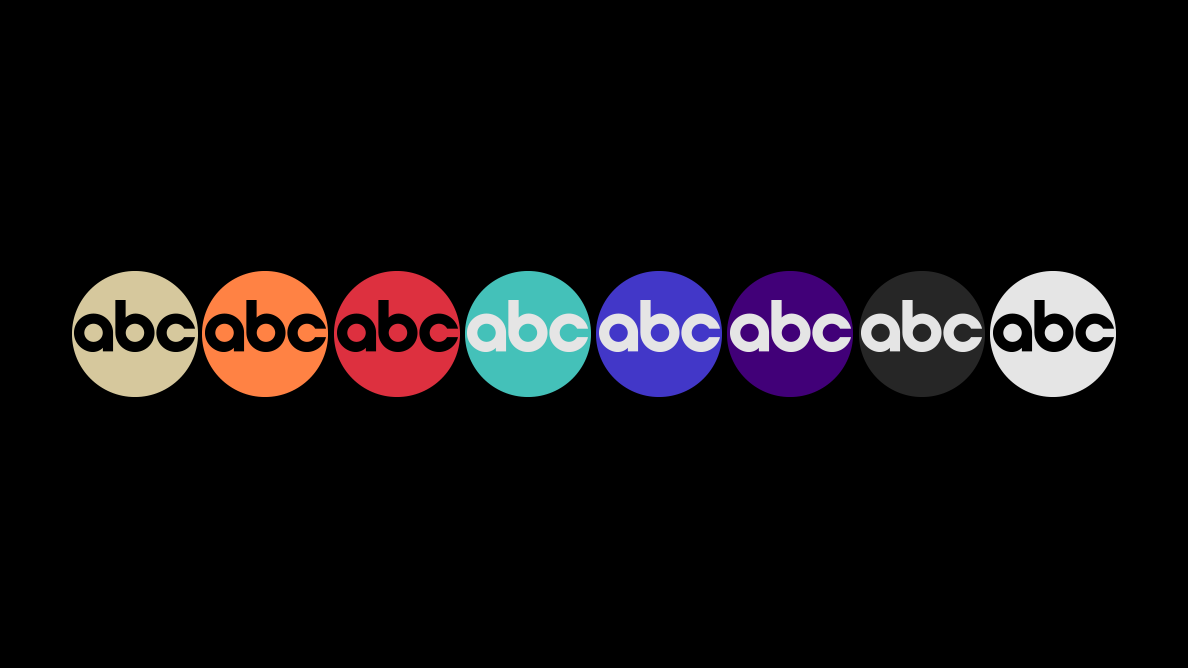


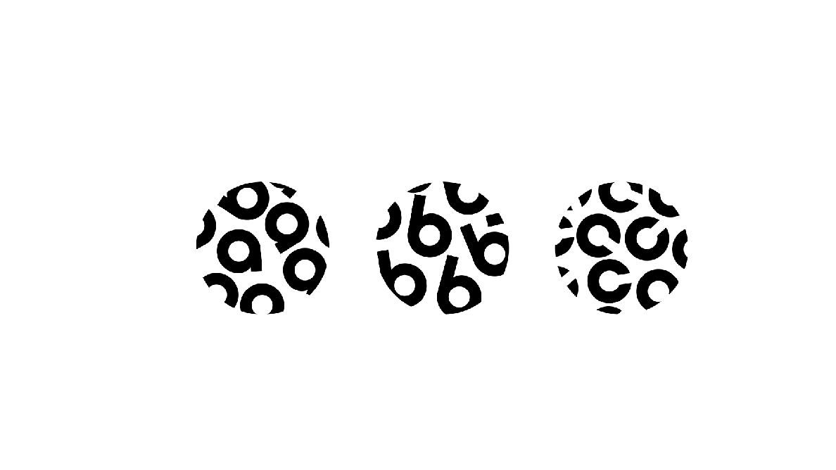
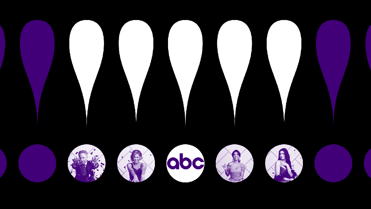

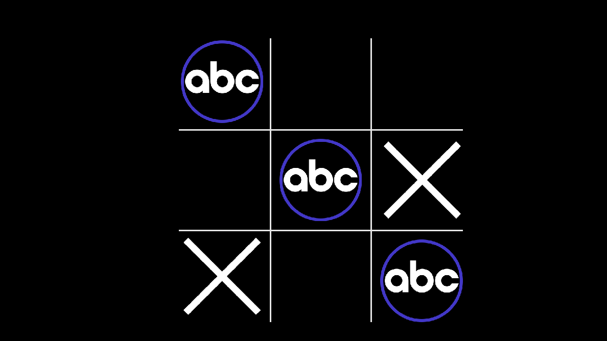


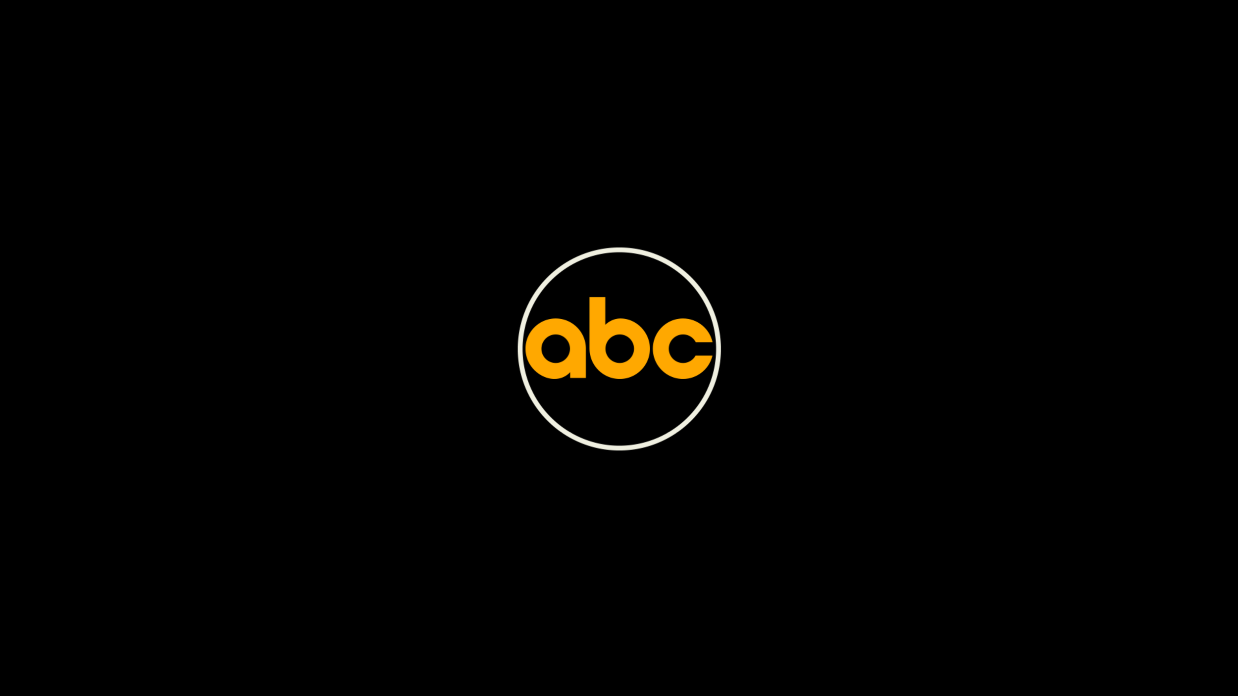

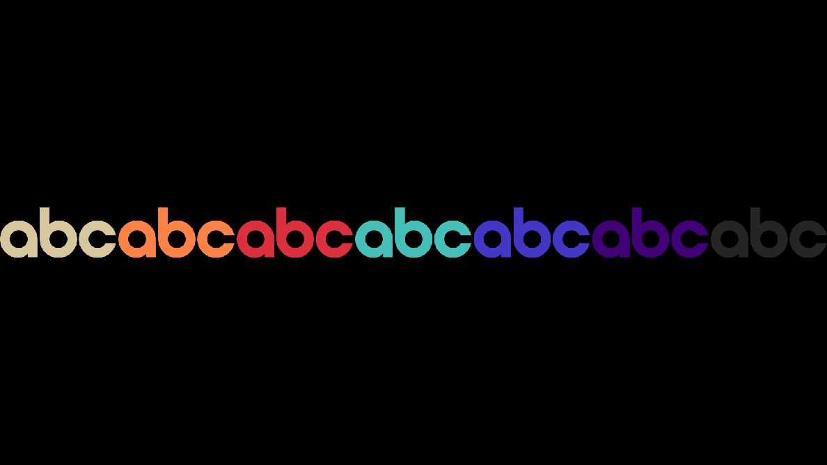
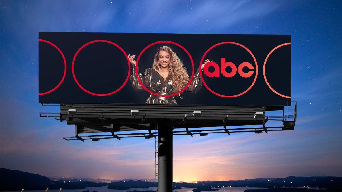
That simple Paul Rand circle became the foundation of the new identity
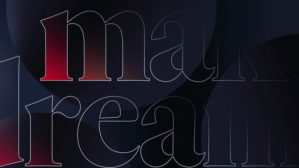
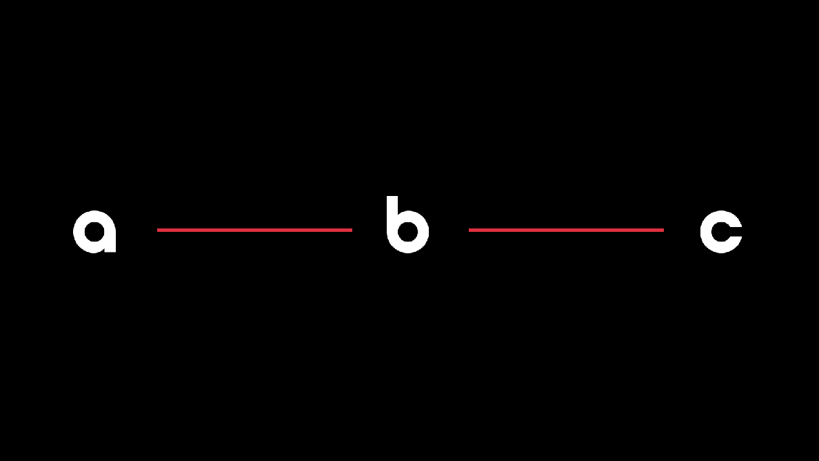
Part of what makes Paul Rand’s designs so iconic, so appealing, is the repetition of pure, essentialist shapes and forms—lines, circles, and points. For ABC, I pushed us to bring the logo back to that baseline. We curved that line to make a ring, and treated the letterforms as points in space.
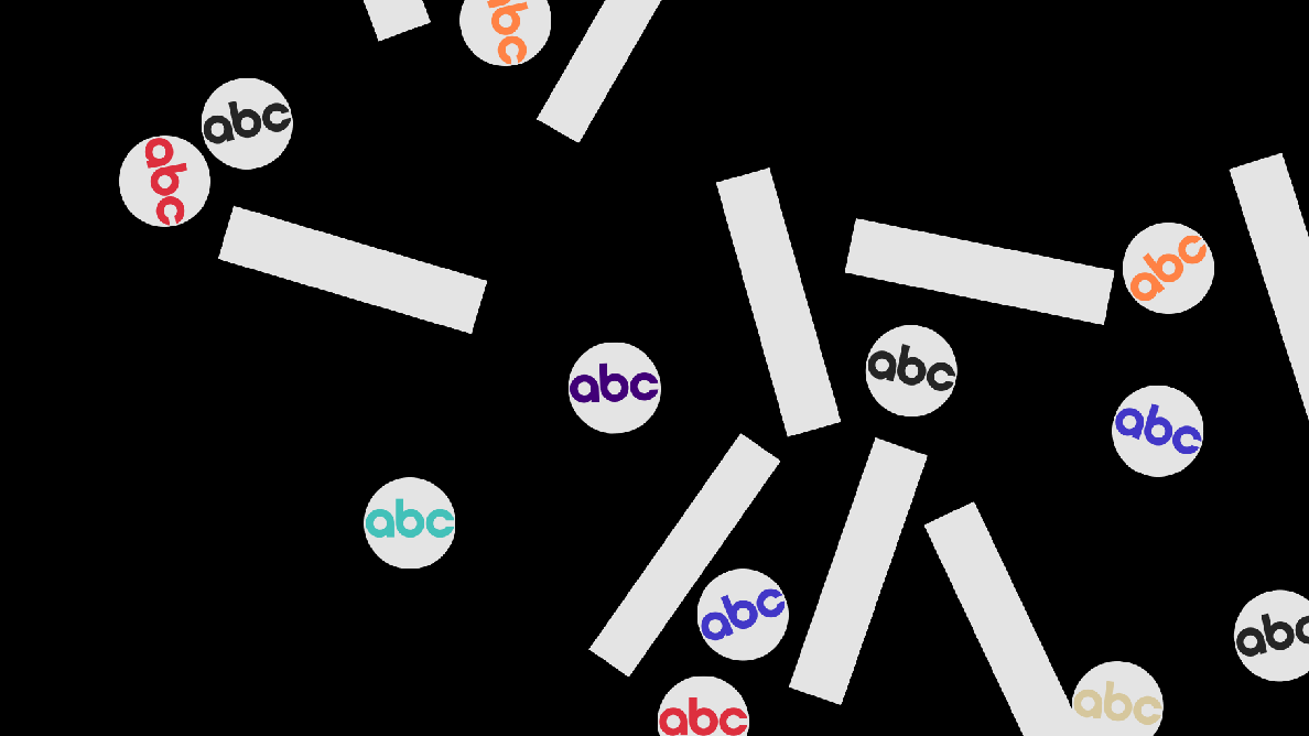
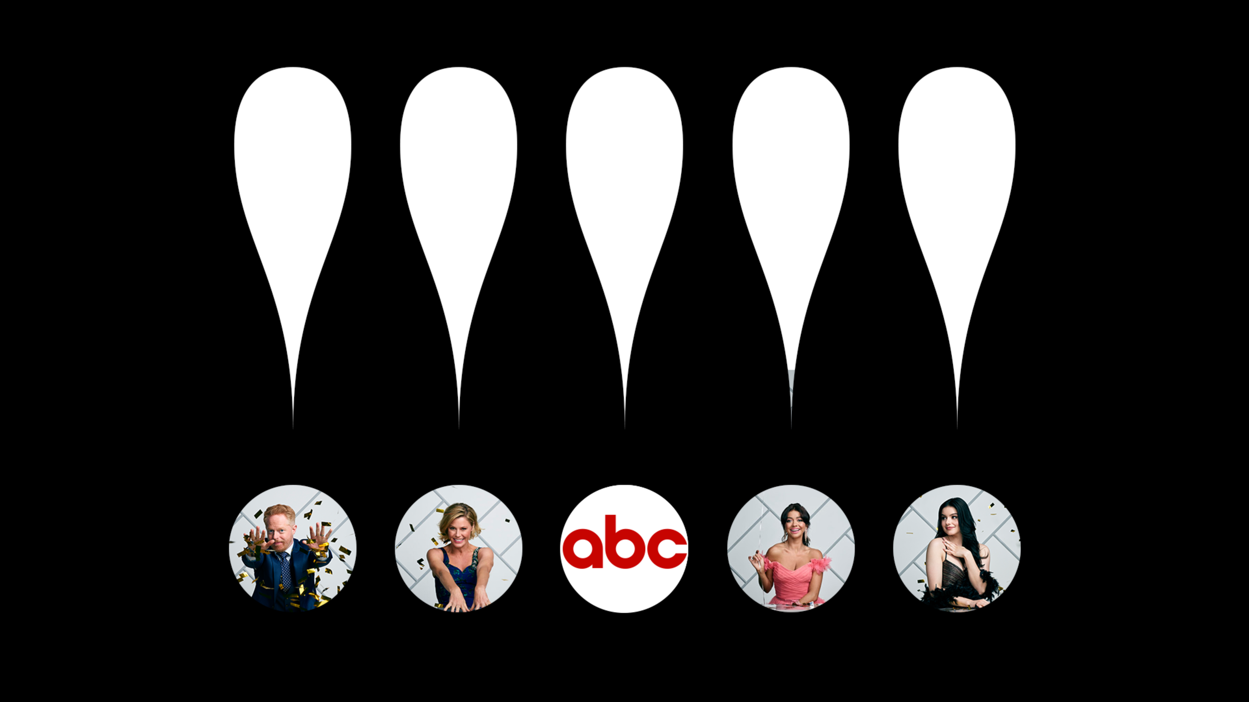
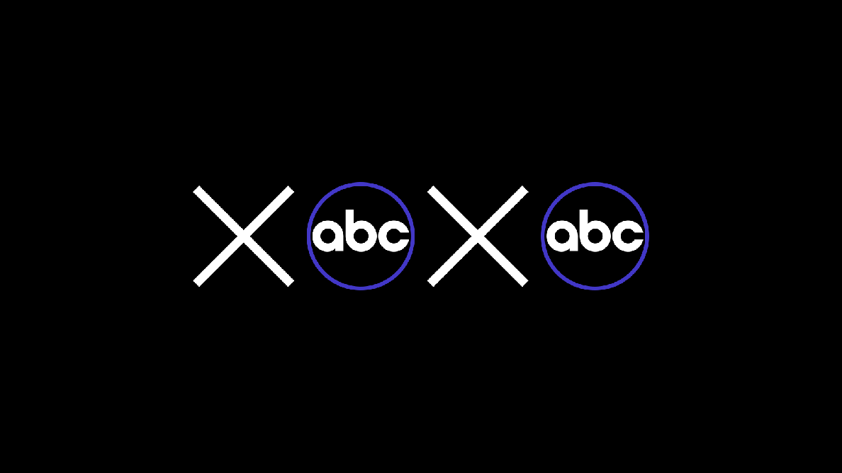
Then, after the logo was updated and optimized, we applied motion to those design elements to reinterpret those Rand vibes in action. Creating a flexible, modern visual identity system, while capturing as much of that legacy feeling as possible.
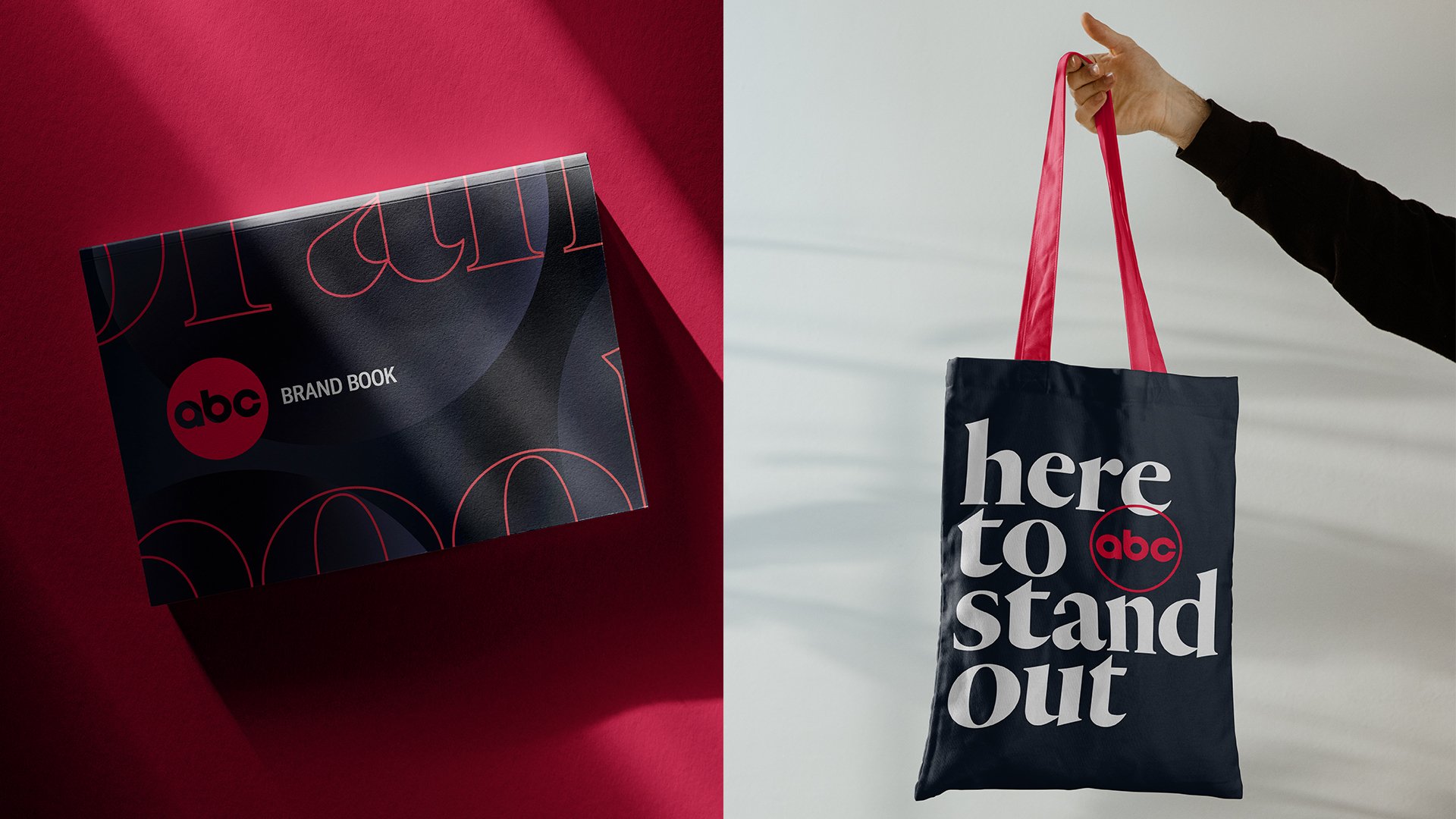
A clean, sleek identity with the simplicity and flexibility to last